When Paint Had Personality
Classic cars have a way of making bold colors feel completely normal, even when those same shades would look terrible on a crossover or commuter sedan. But even though they can get away with a lot, that doesn’t mean every color deserves a spot on old-school sheet metal. Come with us as we explore which colors look best on blasts from the past, and which hues should never touch your classic baby.
1. Seafoam Green
Seafoam green feels right at home on a car from the ‘50s, doesn’t it? The color just works with an older car’s chrome trim, whitewall tires, or even a relaxed cruiser shape. Put that same soft green on a modern compact SUV, however, and it can look more like an appliance than a style choice.
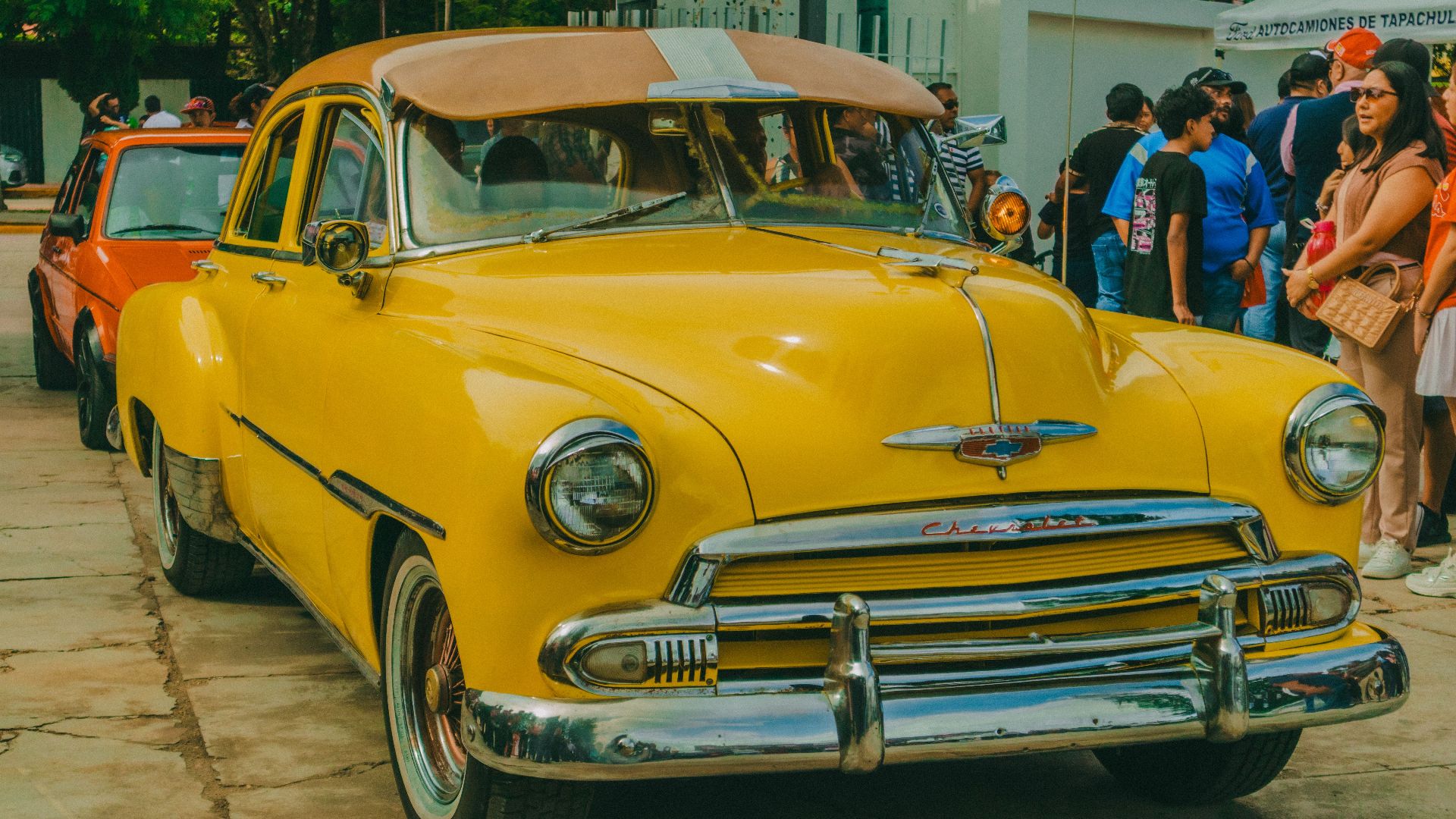
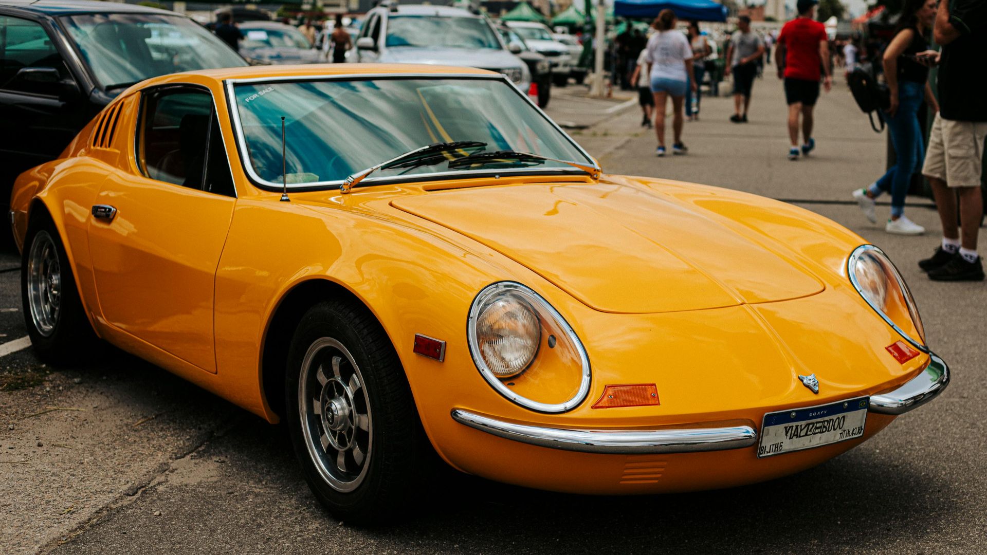
2. Butterscotch Yellow
Butterscotch candy might not be for everyone, but its stunning shade of yellow has a warm, slightly odd charm that suits older cars. It’s not bright enough to feel flashy in a modern way, but it still has enough presence to make a muscle car stand out.
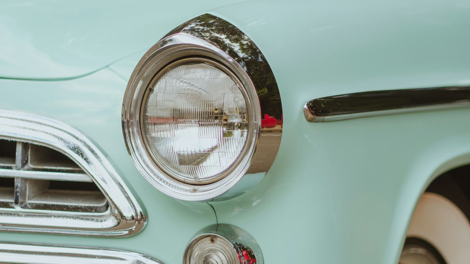
3. Powder Blue
Powder blue looks especially good on the older fellas, where the softer color balances the sporty shape without making it feel too over the top. Modern cars often use blue in darker or glossier forms, so this gentler shade is best painted onto the classics, which we know can pull it off.
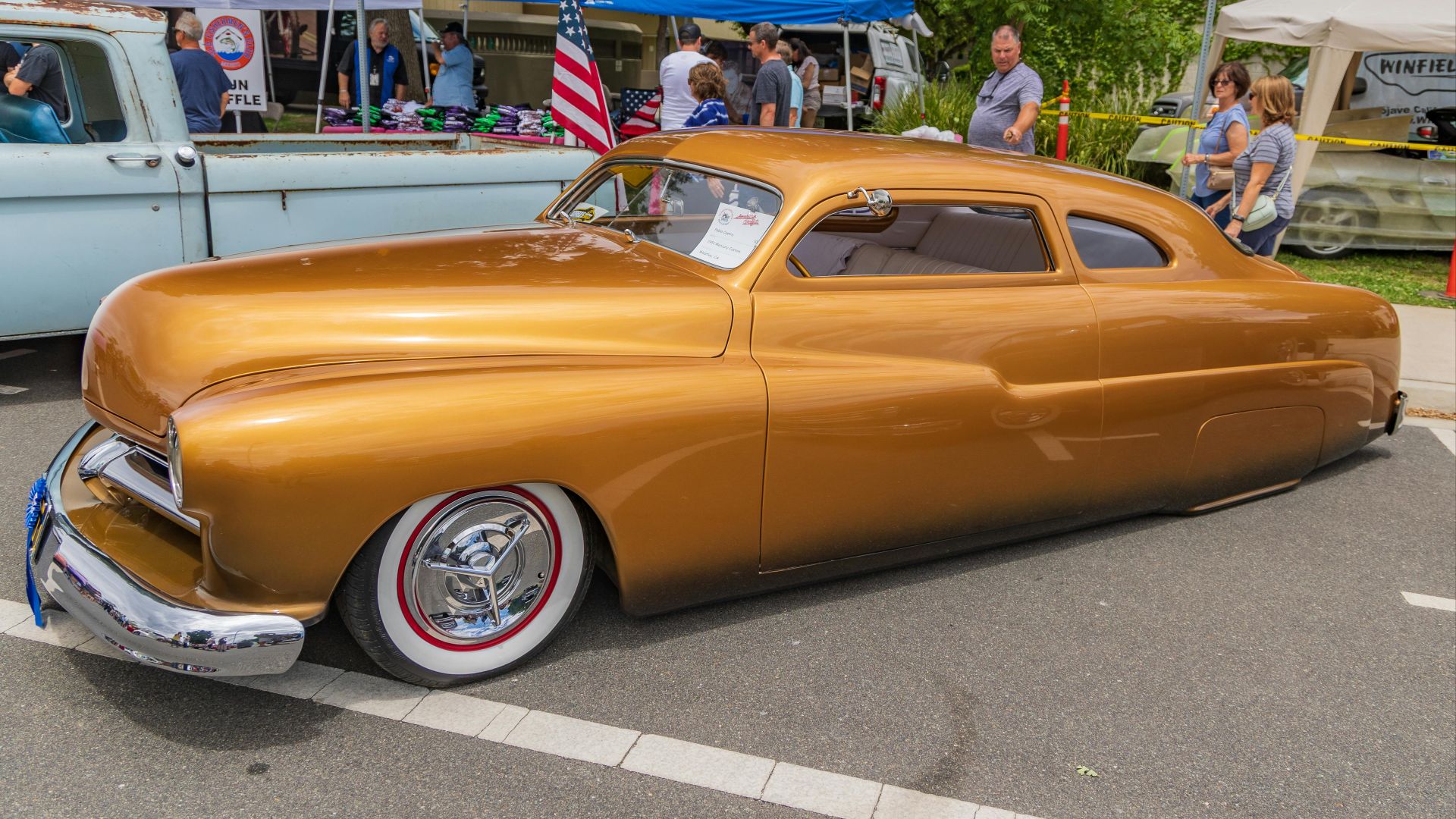
4. Harvest Gold
Harvest gold is one of those colors that sounds risky until you see it on something like a 1972 Chevrolet Chevelle or a classic Oldsmobile Cutlass. The shade has a distinct kind of cool, which is exactly why it works so well on cars from the late 1960s and early 1970s.
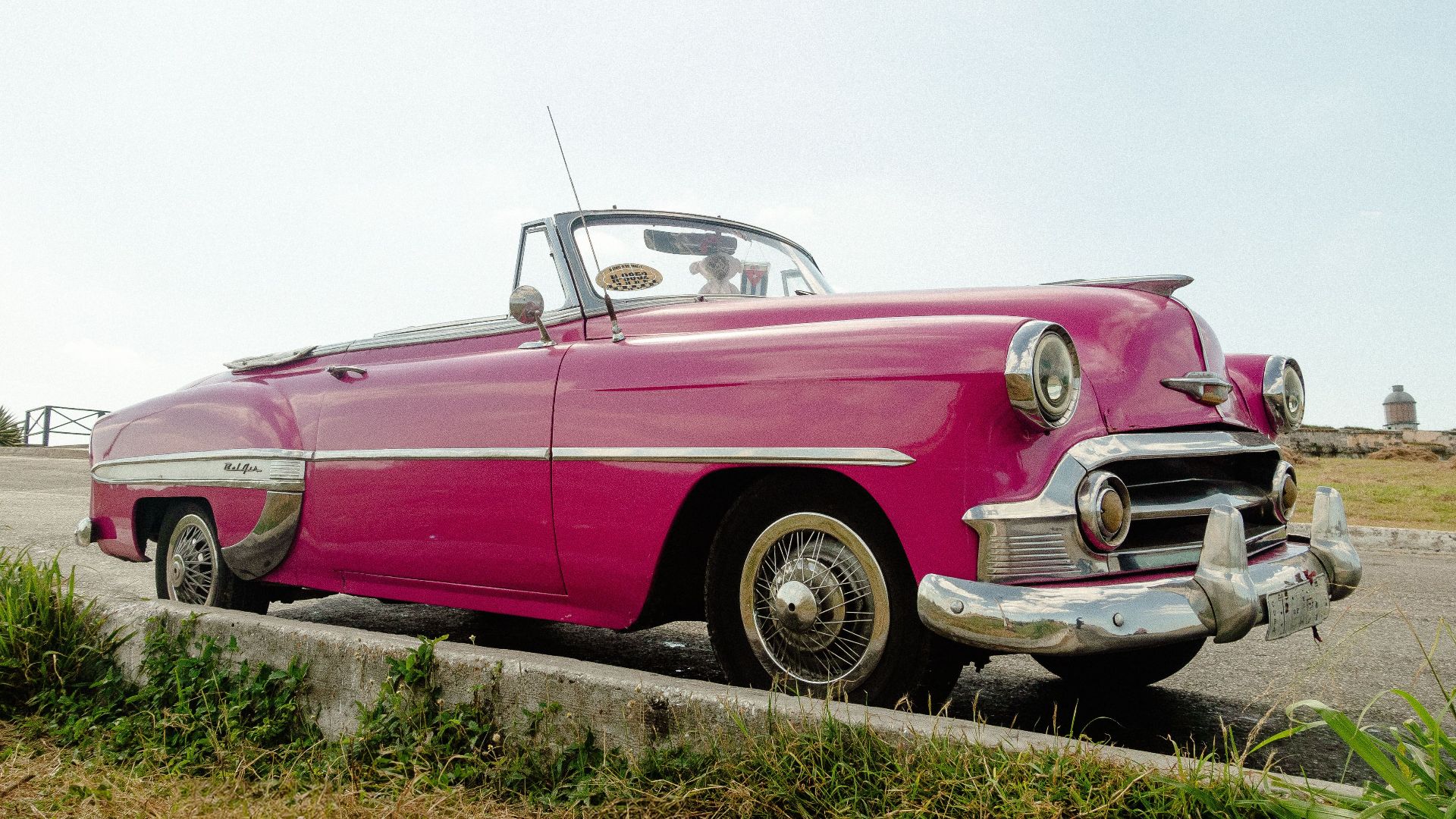
5. Coral Pink
Coral pink might seem a little loud on classic cars, but don’t be so quick to write it off. It’s a shade that needs bright trim, dramatic proportions, and a little sense of occasion to avoid looking out of place. Let’s be honest, you’re only finding that order on older models.
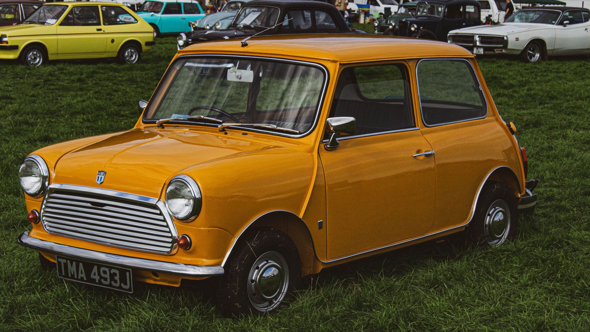
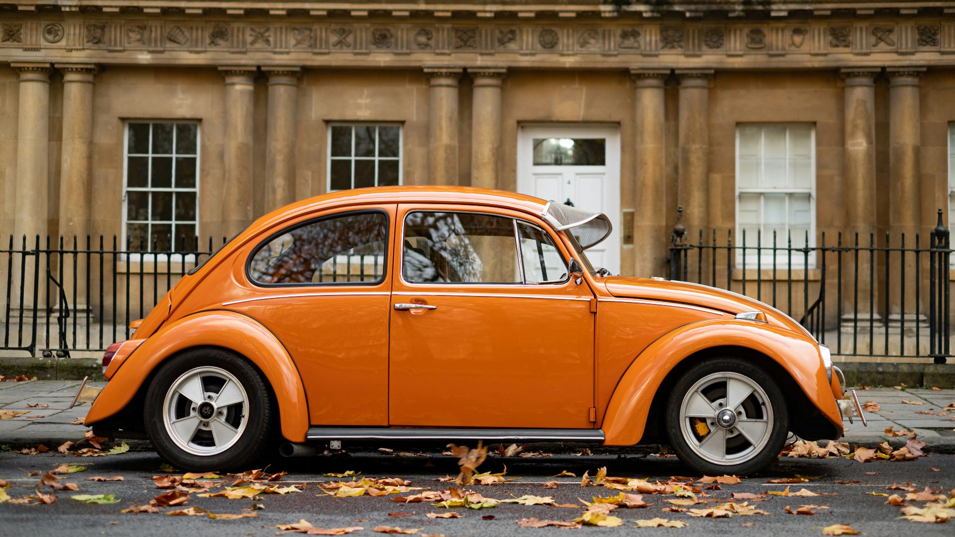
6. Burnt Orange
Burnt orange makes a strong case for itself, even though it might not look like much at first swatch. The color has enough attitude for a muscle car without looking as obvious as bright red, which gives it a more interesting edge. On many modern vehicles, though, it can feel like a special-edition gimmick.
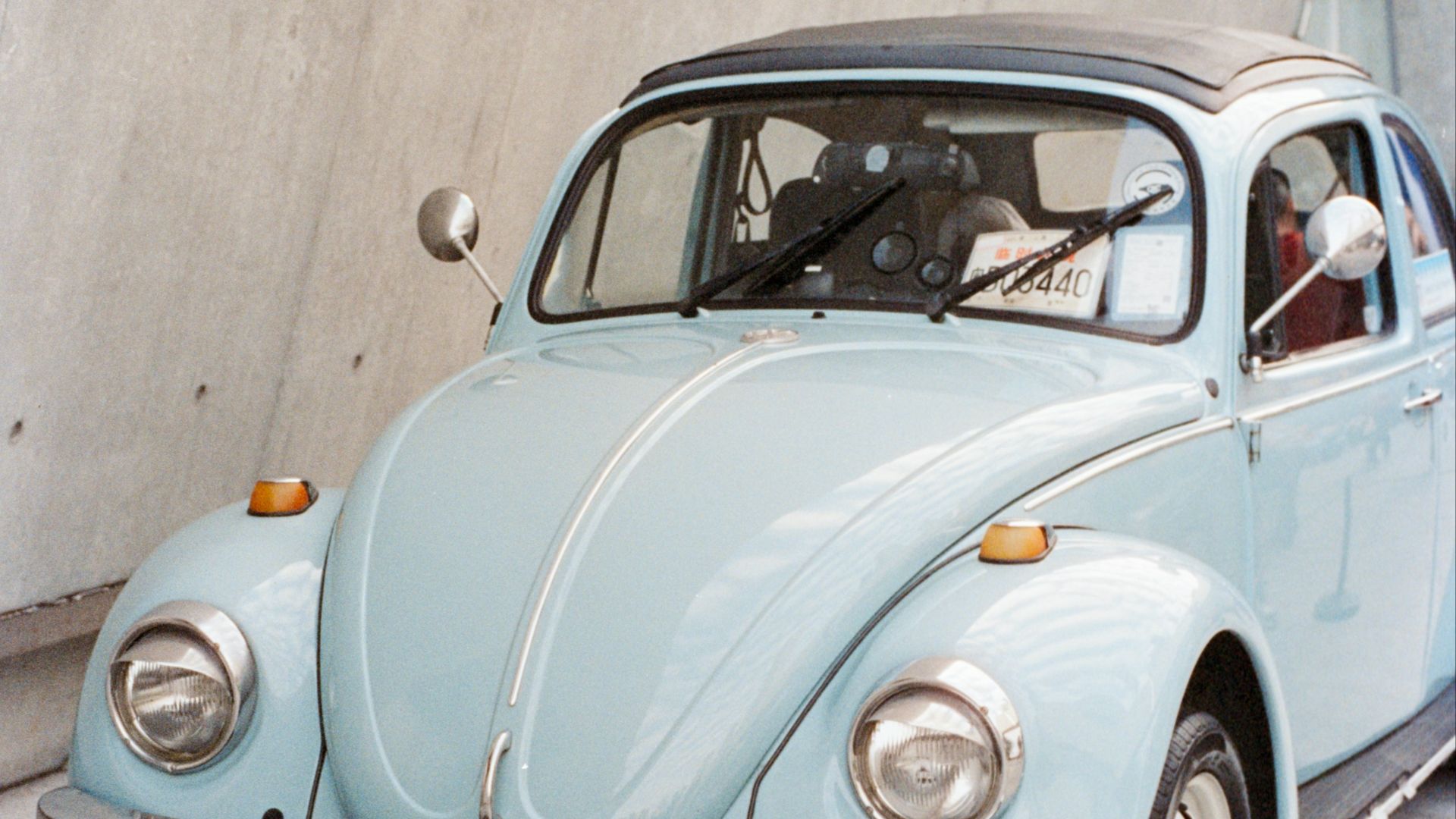
7. Mint Green
There’s a reason why you only ever see mint green on small classics such as the Volkswagen Beetle or an Austin-Healey Sprite! It’s because the color plays nicely with rounded shapes and compact proportions, which is why it looks welcoming rather than forced. It also gives older cars a little more pop, which is what you want.
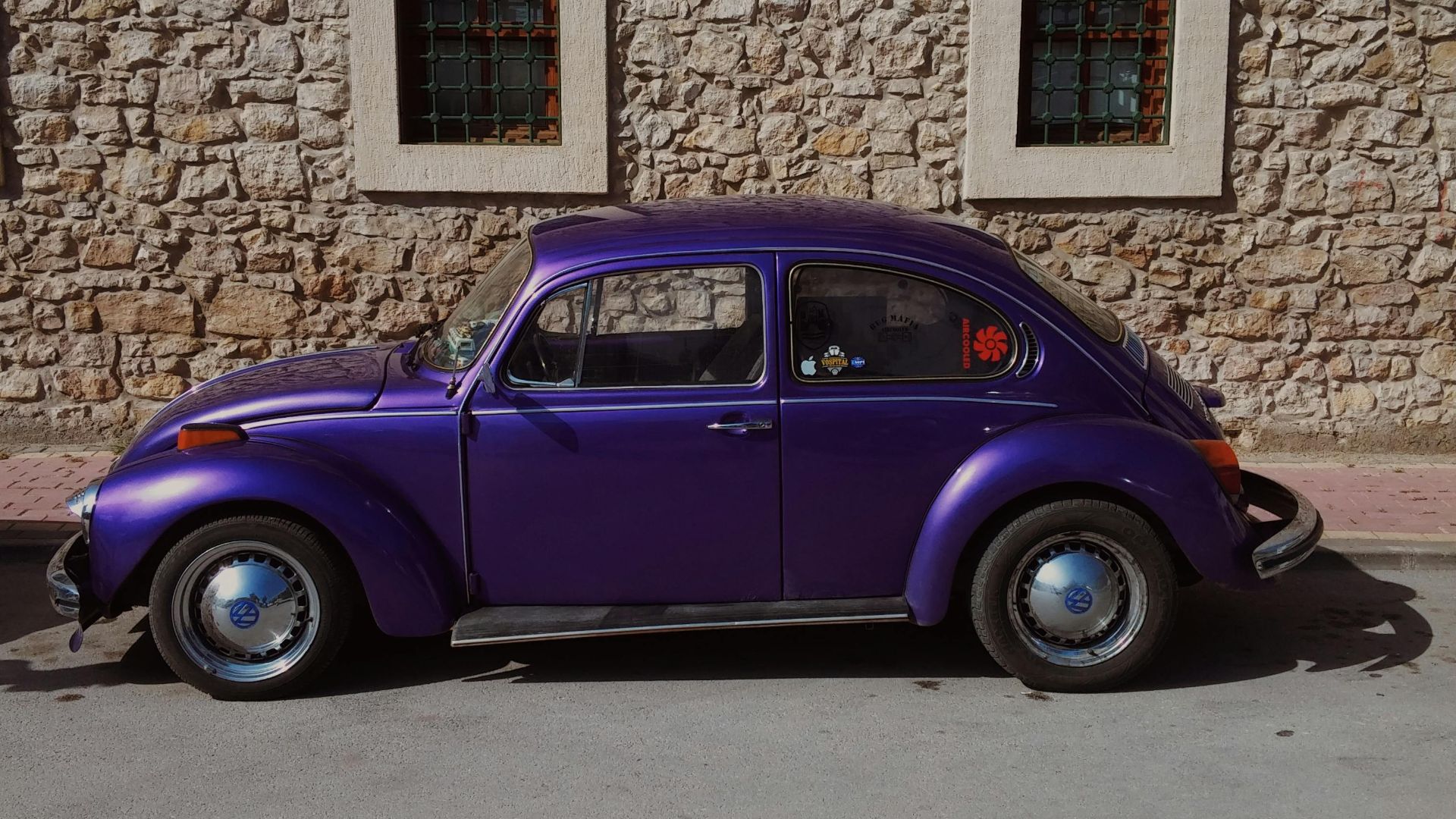
8. Plum Purple
Not every classic car needs a candy shade to stand out. Plum purple feels made for late-1960s and early-1970s performance cars. It has drama, and best of all, it gives those long hoods and wide stances a little extra personality. There’s something about seeing this on a muscle car that shows an owner meant business.
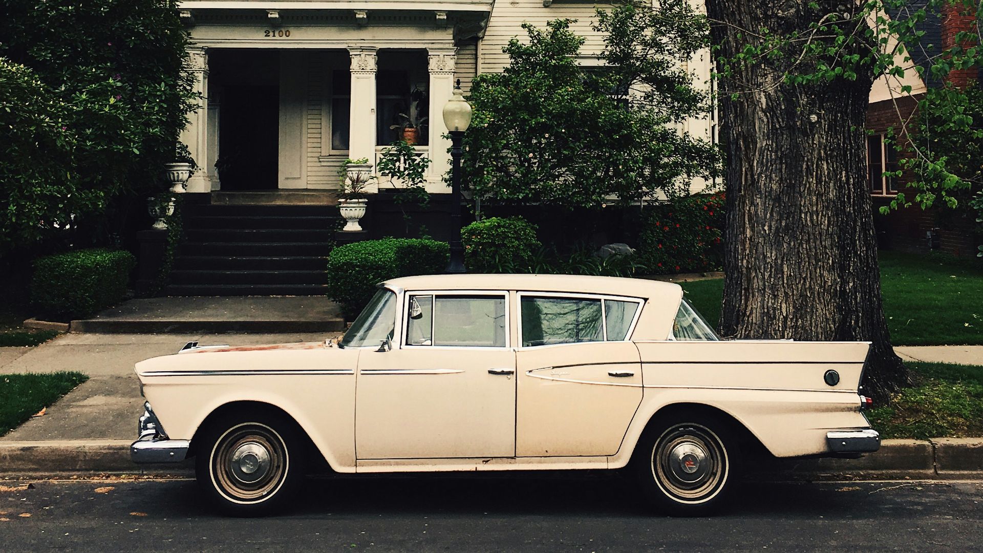
9. Cream White
Cream white gives older cars a warmer, richer look than the crisp whites commonly seen on today’s vehicles. While we don’t want to split hairs on shades, there’s no denying that a nice cream softens an older car’s lines without hiding the details.
10. Turquoise
Turquoise may be the ultimate classic-only color on the list! It shines on classic cars, and the shade has just enough brightness to feel fun while boasting a little refinement. The traditional hue pairs especially well with chrome and a contrasting roof.
Now, remember what we said about not every color looking great on a classic? Well, we’re about to dive into a few that you should stay far away from.
1. Neon Lime
Just because it’s classic doesn’t mean it needs neon shades. The color pulls attention away from the shape, trim, stance, and period-correct details that make older cars special in the first place. You end up noticing the paint before the car, which is a bad trade on a classic.
 nika tchokhonelidze on Unsplash
2. Matte Black
A matte black finish might sound tough on paper, but in reality, it makes classics look unfinished, not intimidating. Don’t forget that these cars were built with brightwork, shine, and surface detail in mind, so removing the gloss can make the whole design feel oddly flat. Even a serious muscle car like a Plymouth GTX looks better with depth in the paint!
3. Electric Blue
Electric blue feels far too modern on classic cars, and the longer the look, the easier it is to see why. The shade fights with restrained body lines, especially when the car’s design depends on elegance instead of shock value. A classic should catch your eye for the right reasons, not because the color came from a tuner catalog.
4. Flat Beige
Flat beige is a rough choice for just about any car, but it’s especially bad on a head-turning classic. Imagine a 1966 Ford Mustang fastback or 1970 Chevrolet Chevelle SS wearing a dull beige with no metallic warmth! The cars still have great bones, but the color gives them nothing to work with.
5. Highlighter Yellow
If you shouldn’t opt for neon green, you definitely shouldn’t choose highlighter yellow either! It asks for attention in a way that doesn’t usually match the character of older cars, so while you can appreciate a bold paint job, this one rarely leaves much room for the actual car to speak.
6. Battleship Gray
Battleship gray has become popular on today’s trucks, but it’s way too heavy on the classics. Older performance cars often need a color with some sparkle, a little contrast to bring out their curves and character lines. Take that away, and the car can seem more like a primered project than a finished restoration.
7. Rose Gold
Rose gold is really more for home accents than a vehicle. Classic trims we all know and love would almost immediately lose their original attitude under a color that feels more fashionable than timeless. The shade also has a habit of making chrome look less crisp, which isn’t what you want on a vintage car.
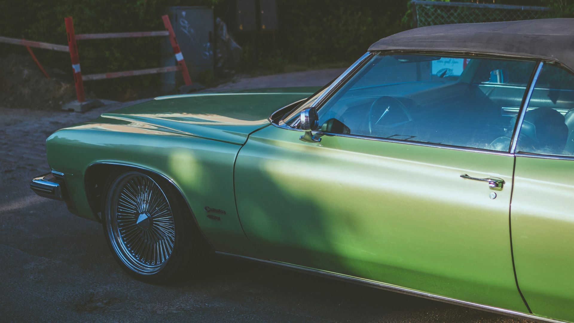
8. Candy Apple Green
Candy apple green sounds fun in theory, but the extra-deep shine pushes classics into custom-show territory—and sometimes, the car doesn’t call for it. A 1957 Ford Fairlane or even a 1970 Oldsmobile 442 already has enough personality without needing a paint job that dominates every panel.
9. Bright White
The last thing you want is for your beautiful classic to look like you covered it in corrector. Stunning older models usually benefit from richer whites or period shades that don’t make the body look too harsh. When the white is too cold, the car loses some of the charm that made it worth preserving.
10. Matte Army Green
Matte army green is a poor match for most classic road cars, even if it looks good on other vehicles. Put it on a 1967 Pontiac Firebird, and the result can feel like the car’s original personality got covered up. A classic doesn’t need to look delicate, but it also shouldn’t look like it’s hiding from its own styling, either.