

The Stories Behind The Symbols
Car logos are more than simple graphics stuck on the front of a vehicle. They’re carefully chosen symbols that tell a story about each brand’s origins, values, or ambitions. And many of these designs carry historical references or clever visual tricks that most people never notice, even after years of driving past them. So, here are 20 car logos with hidden meanings that reveal exactly why they were designed the way they are.

1. Toyota
Three overlapping ovals define Toyota's iconic logo, introduced in 1989 for its 50th anniversary. The design cleverly forms a stylized "T" while representing a deeper meaning: two inner ovals symbolize the bond between company and customer. Meanwhile, the outer oval embraces Toyota's global presence.
 ifj. Lukács Gábor on Wikimedia
2. Subaru
Six stars form Subaru’s logo, a nod to the Pleiades constellation, which actually includes seven. Standing apart from other automakers, this Japanese brand’s emblem carefully represents five founding companies and the larger organization uniting them.

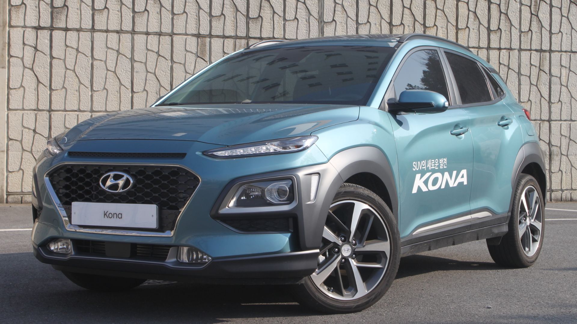
3. Hyundai
The distinctive "H" in Hyundai's logo often gets mistaken for Honda's emblem. However, this slanted letter actually depicts two figures sharing a handshake. Beyond that, the oval border represents the company's worldwide reach, while the overall design symbolizes trust between Hyundai and its customers.
4. Mercedes-Benz
Gottlieb Daimler once sent his wife a postcard that inspired the Mercedes-Benz star. His son Adolf later developed the three-pronged shape, registered in 1909 by DMG. This symbol goes beyond style, marking authority on land, at sea, and in the air, all framed within a worldwide circle.

5. Mazda
Since 1997, Mazda's distinctive logo has carried deep meaning in every curve. The oval shape represents the global community, and the wing-shaped “M” inside speaks to flexibility and resilience. Meanwhile, the stylized wings symbolize both improvement and creativity, which represent a bird's free flight.

6. Audi
The origins of Audi’s emblem trace to 1932, when four carmakers merged to form Auto Union. Each of the logo’s rings denotes a founding brand. With no ties to Olympic imagery, the rings of Audi, along with DKW, Horch, and Wanderer, have survived stylistic changes.

7. BMW
A common misconception suggests BMW's logo represents a spinning propeller, yet the truth lies in its Bavarian heritage. The roundel, inspired by Bavaria's flag, showcases the state's official blue and white colors. Since 1917, subtle adjustments to fonts and borders haven't altered this core design.

8. Porsche
The Porsche emblem reflects deep German tradition. At its center, Stuttgart’s prancing horse blends with Württemberg’s heraldic coat of arms, complete with antlers and red-black stripes. Designed in 1952 by Xaver Reimspieß, this rare full-armorial insignia has endured across decades of automotive history.
 Car leasing made simple from Slough, UK on Wikimedia
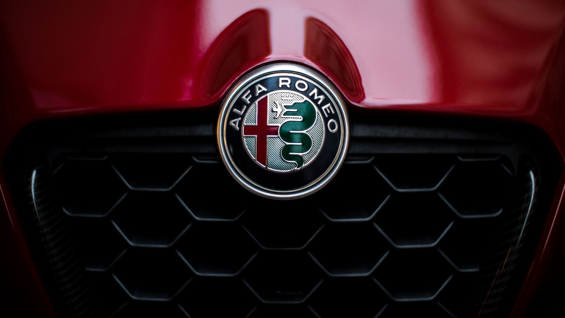
9. Alfa Romeo
Milan’s past inspired Alfa Romeo’s logo, which shows a serpent swallowing a man. Called the “biscione,” this emblem originated with the Visconti family, historic rulers of Milan. Many interpret this serpent as representing rebirth, and the red cross alongside it remains a source of discussion.
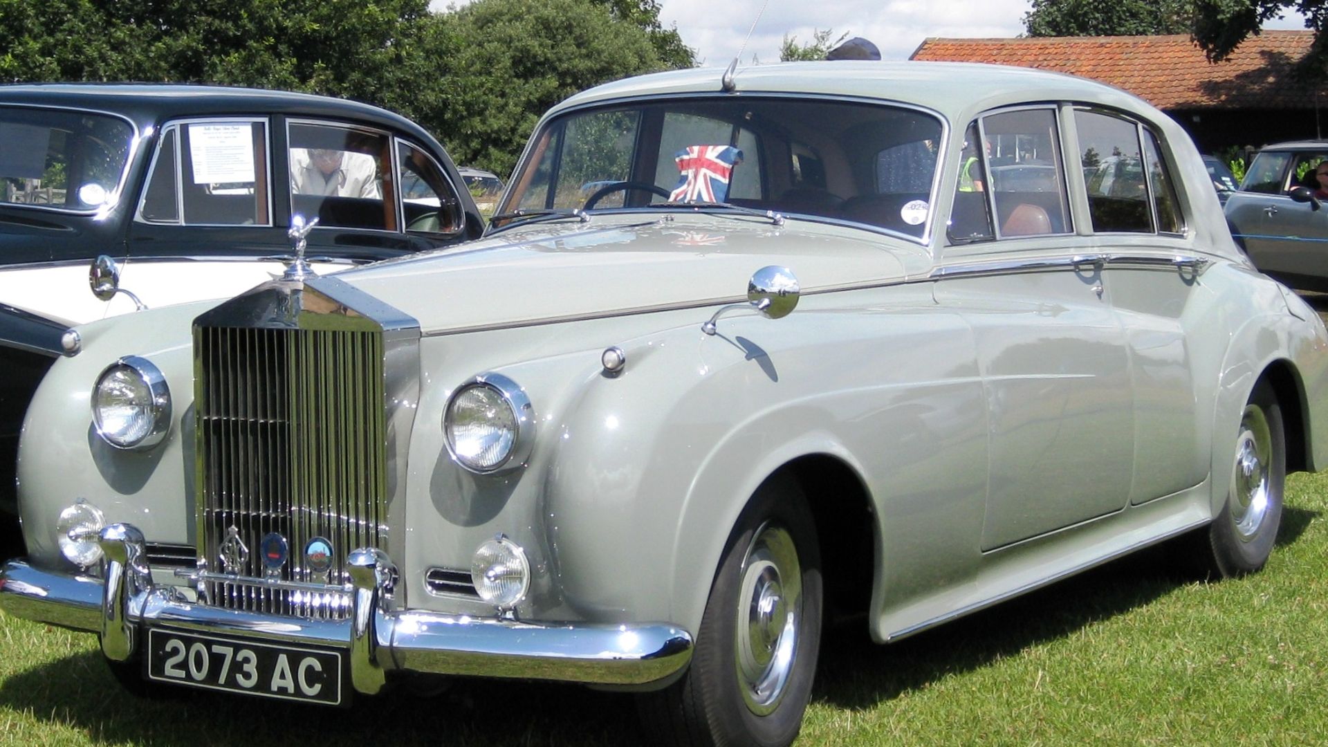
10. Rolls-Royce
Eleanor Velasco Thornton's likeness became the Spirit of Ecstasy, born from an untold love story. Since 1911, this mascot has adorned Rolls-Royce vehicles, while its flowing robes symbolize the perfect blend of speed, grace, and elegance.
11. Lamborghini
On Lamborghini’s crest, a golden bull surges ahead, honoring Ferruccio’s Taurus zodiac. Its striking posture mirrors the marque’s reputation for speed and power. Here, black paired with gold signifies prestige, and the bull further symbolizes resilience and Ferruccio’s passion for the drama of bullfighting.

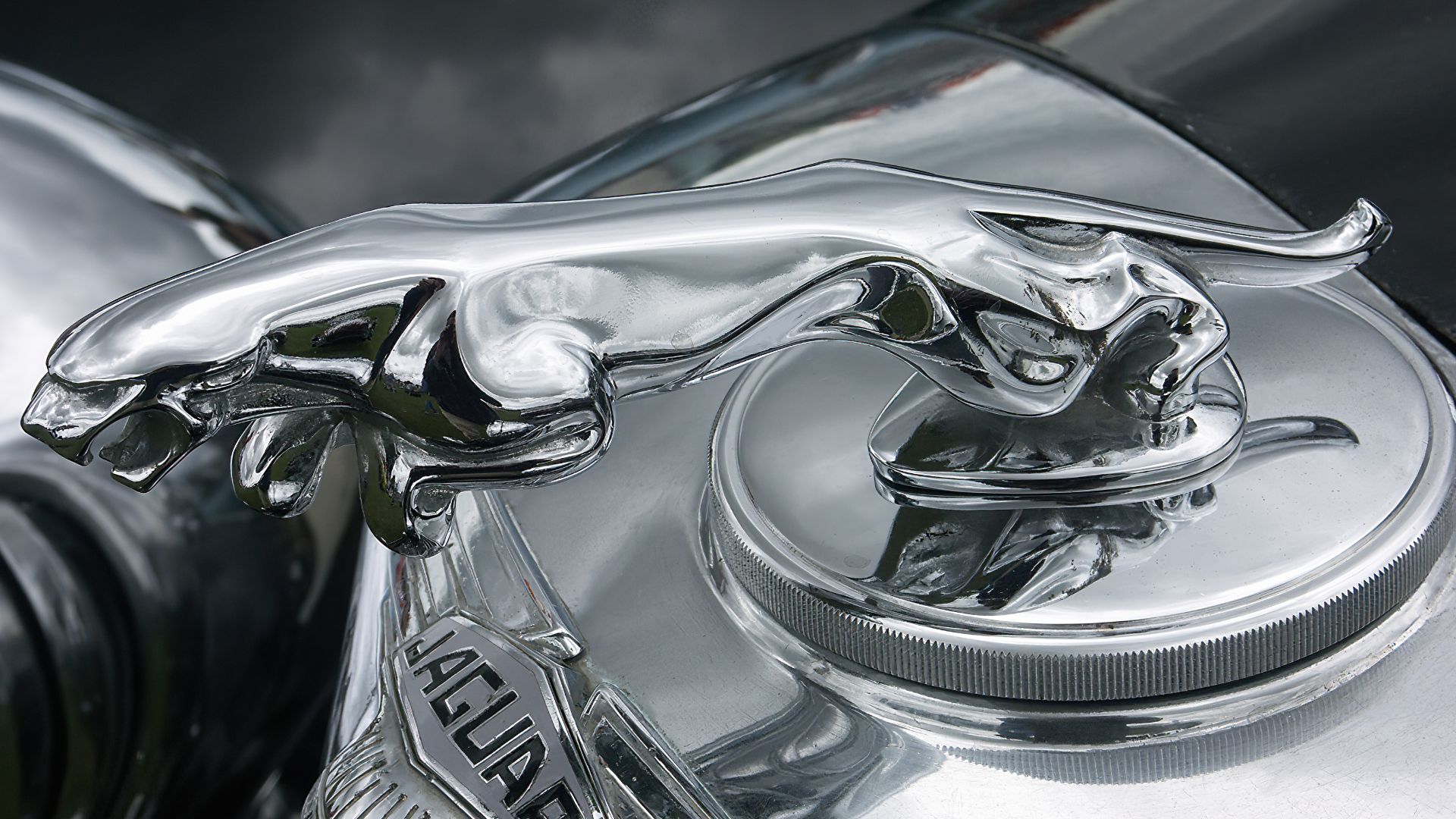
12. Jaguar
Jaguar’s famed mascot, nicknamed “The Leaper,” embodies the brand’s focus on agility. First created as a sleek side profile, it evolved into a bold three-dimensional figure. This design conveys motion, strength, and speed, making it one of the most dynamic emblems in the automotive world.
13. Ford
Among iconic car symbols, Ford’s blue oval is instantly recognizable. The color represents reliability, and the white script reflects Henry Ford’s own signature. First designed in 1907 by Childe Harold Wills, the flowing calligraphy embodies a tradition of craftsmanship and conveys lasting trust.

14. Chevrolet
Since 1913, the Chevrolet bowtie has represented automotive excellence, though certain early and specialty models carried different emblems. Often called the Chevy bowtie, this iconic symbol's backstory remains contested. Some trace its design to wallpaper patterns, while others point to a stylized cross.
15. Renault
A diamond has graced Renault vehicles since 1925, evolving through multiple iterations yet preserving its essence. The shape was selected specifically for geometric clarity and sophistication, not as a car grille. Meanwhile, the emblem symbolizes innovation and quality.

16. Lincoln
The Lincoln automobile brand showcases a distinctive four-pointed star encased in a rectangular frame. This refined emblem, known simply as the Lincoln Star, represents elegance and luxury, yet the true origins behind its mysterious design remain undiscovered.

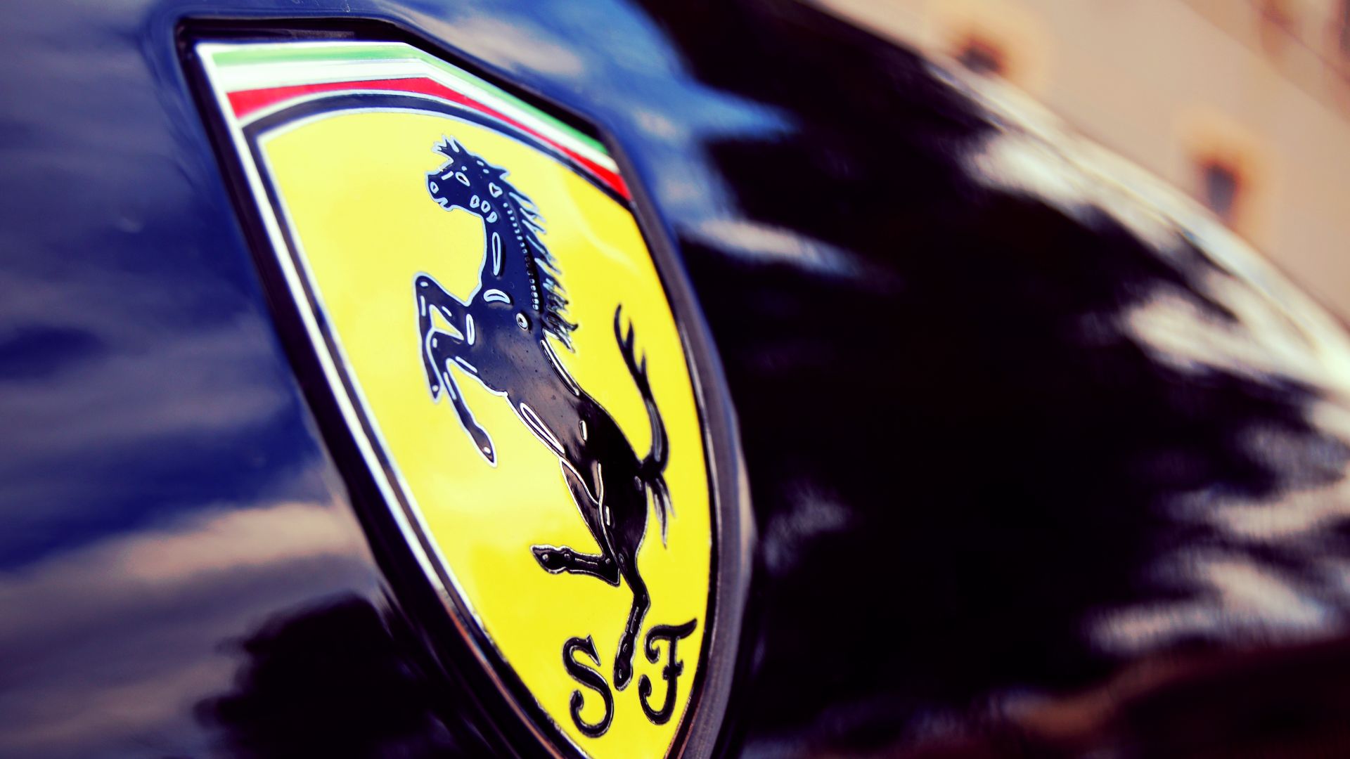
17. Ferrari
Ferrari’s logo unites “S F” for Scuderia Ferrari with the prancing horse once displayed by WWI pilot Francesco Baracca. Its yellow backdrop pays tribute to Modena. Together, the color and stallion symbolize the speed central to Ferrari’s identity.
 Danny Galvez from Pinoso, España on Wikimedia
18. Peugeot
A noble lion has graced Peugeot's identity since their saw blade manufacturing days in 1858. The emblem initially featured the creature atop an arrow to convey speed. However, over time, the design shifted to a refined lion's head while preserving symbols of strength.

19. Citroën
French engineering brilliance shines through Citroën's iconic double chevron emblem. This design stems from founder André Citroën's helical gear invention, with chevrons mirroring actual gear teeth shapes. Though modified repeatedly since 1919, this technical symbolism remains central to the brand's identity.

20. Mitsubishi
Three striking red diamonds anchor Mitsubishi's iconic emblem, inspired by the founder's family crests and the Tosa Clan. It first appeared on ships in 1874 through Tsukumo Shokai. Interestingly, the name itself combines "mitsu" (three) and "hishi" (water chestnut, diamond shape).